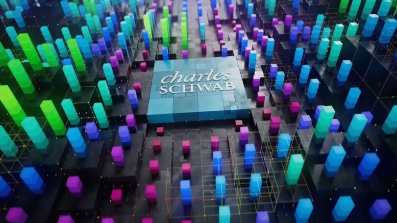
Delivering data-driven messaging in a visually stunning way
Last fall we were approached by our good friends from TRG for help with a dynamic broadcast campaign for their client, Charles Schwab. Schwab was looking to introduce its new trading services, Schwab Trading Powered by Ameritrade™ and thinkorswim® trading platforms which are part of that new offering. The creative brief and tight timeline presented both artistic and technical hurdles, but it’s projects like these that fuel our creative drive and push us to get better at what we do.
“From an art and design standpoint, I love the challenge of turning very complex data-driven messaging into engaging visual metaphors that are exciting and fun to watch,“ shares Barrett Lewis, Republic Design’s Creative Director who spearheaded the project. The campaign featured three base spots which detailed different aspects of Schwab’s new trader offering. The delivery schedule required the first spot to be delivered in just two weeks with the full campaign needing to be completed inside of two months. With all that in mind, our team jumped deep into both broad strokes and specific details early on in the pitch phase.

“We wanted our treatment to be thoughtful and thorough,“ explains Barrett, “so we included a set of B&W storyboards (consisting of quick sketches of the mechanics of how things would move), finished style frames, and animation references to visually describe our world of Schwab. It’s always really important to not only show our take on the design but on the story as well. Ultimately our goal is to answer as many questions as we can up front, show glimpses of what the finished product will look like as early as possible, and gain our client’s trust so that we are continually comfortably moving forward in tandem.”
“The Republic team was amazing to collaborate with,” shares Dave Stone, TRG’s ACD / Art Director. “From the very beginning they were constantly bringing new and unique thinking and perspective to the campaign without ever losing track of the initial concept and intent. That delicate balance between bringing all their amazing talent to the table while still working to preserve the integrity of the concept is so great to have in a creative partner.”
Our direction was simple – create visual metaphors from the script’s messaging and turn them into a landscape that we can fly through. For the first spot, ‘Platform’, we expanded the thinkorswim® UI graphics into three-dimensional architecture that dances and undulates. The second spot ‘Education’, leaned more on physical textures and featured floating cubes of hard-backed books to illustrate a digital library of courses, articles, videos, etc. available to Schwab clients. “This was one of my favorite parts of the campaign, “says Barrett. “I have an affinity for floating books. They’re just nostalgic and magical because we’ve seen that trope throughout fantasy films and TV.” The final spot, entitled ‘Service’, leaned more into the humanity of the offering, and focused more intimately on singular vignettes to end the campaign with a very personal touch.
TRG’s ACD / Writer, Alexis Bingham, described the first rough cut viewing by saying, “Republic had already done so much work in the right direction on their treatment that the first rough cut viewing wasn’t a shock to the system. It was further confirmation that we’d made the right decision, and we were going to come out of this thing with something great. It also made us fully aware that Republic was part of our team now. They were there to communicate, collaborate, dig up solutions, and make changes that would hit all the right notes for our client while preserving the integrity of the creative.”

“I can’t say enough about how fantastic the whole team from TRG was to work with,” adds Barrett. “At every point of the process, they patiently helped navigate us through difficult creative problems and trusted us to develop and evolve their ideas further. They were really more part of our team than a client, and that brought a level of synergy that was impeccable in getting everything done not only on time but with a certain level of polish.”
Once the visuals were locked, our Senior Sound Designer, Greg Carlson, carefully wove an immersive auditory landscape around the accompanying voiceover and original music composed by Shindig. “The creatives gave me probably my most favorite direction I can get as a sound designer,” shares Greg, “They said ‘Go explore and have fun with this’. I tried to keep it clean, sophisticated, not too sci-fi, and used digital textural sounds that were always evolving. The whole mix process with the TRG team was totally synergistic – they had such a strong level of trust and I couldn’t be more proud of how it turned out.”
In the end, we delivered all spots of the stunning and engaging campaign in multiple aspect ratios and in varying lengths, all inside of the tight deadline. “We had approximately one million and four pieces and parts flying around each of the three videos at any given time,” describes Alexis. “After seeing the incredible amount of beautiful, high-quality work Republic accomplished in an impossible amount of time, I’d happily and confidently call on this crew anytime.”


