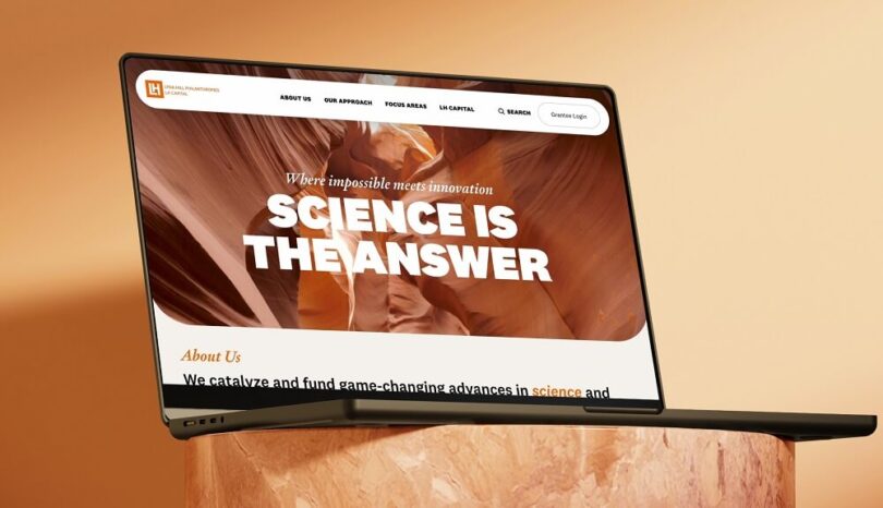
Lyda Hill Philanthropies enlisted Tegan for a full overhaul of their digital platform. The digital-first, full service agency designed and developed a new site to better communicate the philanthropy’s mission and impact in the Texas and Colorado communities.
Few compare with Ms. Lyda Hill ‘s decades of contributions as a pioneering entrepreneur and philanthropist. Back in 2010, Ms. Hill signed the Giving Pledge (sponsored by Bill and Melinda Gates, Warren Buffet, and others) and committed to donate the entirety of her wealth to philanthropic initiatives during her lifetime.
Lyda Hill Philanthropies and LH Capital are the organizational hubs that exist to make Ms Hill’s extraordinary vision a reality. Both entities came together under one roof in a brand new, fully redesigned site for potential grantees and community partners to access resources across the organization’s four focus areas of work: science, nature, nonprofit empowerment, and community investment.
The Tegan team was recruited to tackle strategy, design, and development for the new site, working alongside the LH team to build a smart, engaging platform that clearly communicated the organization’s distinct offerings while infusing Ms. Hill’s inspiring approach to life and work on every page.
Tegan’s design team skillfully integrated the characteristics of Ms. Lyda Hill herself into the site’s design with fun, eye-catching visual elements. They used large, bold typography, close-up shots of science imagery, a bright color palette, and other techniques to communicate both innovation and optimism for the future. To showcase the organization’s unique, two-pronged approach, Tegan also created a custom spectrum illustration to feature on the Our Approach page.
A Senior Associate from Lyda Hill Philanothropies applauds the partnership. “Tegan stuck to a timeline and adjusted quickly as new opinions surfaced. Additionally, they were very communicative and collaborative. Overall, outstanding.”
The development team from Tegan also implemented a sleek, modular design along with micro-UX elements to streamline interactions and a seamless user experience. They included standardized page templates to ensure that the LH team could easily create and maintain pages as content needs evolve.


