
original content
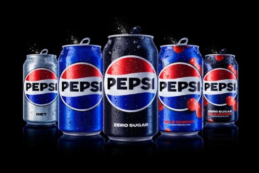
The new design includes a can silhouette that is meant to be easily integrated into advertising—for instance by overlaying it over pictures of food that pairs with the cola.
The logo change is Pepsi’s 12th since its founding in 1898 and its first since 2008, when Pepsi introduced the “smile” globe and the lower-case wordmark. That change, despite being met with some mixed reviews, will have lasted longer than any other look in the company’s history, said Todd Kaplan, chief marketing officer of Pepsi.
Kaplan said he and Mauro Porcini, PepsiCo’s chief design officer, began looking at renewing Pepsi’s brand identity about three-and-a-half years ago. Kaplan confessed that the current Pepsi logo lacked the “boldness and confidence” to match the evolution of the Pepsi brand, and had grown “a bit muted for today’s standards.”
PepsiCo’s carbonated beverages could use a shot of new energy. Its portfolio of carbonated soft drinks lost volume and dollar share to rival Coca-Cola last year, according to Beverage Digest figures covering most retail outlets. Among cola brands, Coke held a 16.2% dollar share to Pepsi’s 8.2%. The biggest gains in market share belonged to Coke Zero Sugar, which gained 0.4% and holds a 4% dollar share. Pepsi Zero Sugar gained 0.1% to hold a 0.8% share. Pepsi Zero Sugar has been recently reformulated and Pepsi is advertising heavily to encourage consumer trial.
Porcini said the company led the design work but also consulted with various outside agencies to validate ideas. The company’s research indicated Pepsi fans young and old had a strong affinity for the wordmark inside the logo, leaving designers the challenge of doing so while also modernizing the look. The “Pepsi pulse” effect is one way of doing that, Porcini said. These dots, lines or spaces appearing on packaging and online are meant to change over time, keeping the design contemporary and relevant in different parts of the world, said Porcini. The black, which encircles the globe, indicates Zero Sugar “becoming the protagonist of all our communication,” according to Porcini. That is because the Zero Sugar variety has long used the color black in its design.
Changing the visual branding of a business the size of Pepsi is no small undertaking, and Kaplan declined to specify the cost. “If you think of the amount of touch points this brand has, from fountains and cups to vending machines, to trucks to cans to signs to stadiums, this is a massive undertaking,” he said. “And it’s something that will take time to roll out in the marketplace effectively because of that.”
In addition to boldness and confidence, Kaplan said the new look needed to convey Pepsi’s brand of “unapologetic enjoyment,” while acknowledging the brand’s heritage. Finally, Kaplan said the identity needed to be “built for the digital era,” or be adaptable to formats ranging from streaming TV to Web3. That includes using more animation and movement, “unlocking more flexibility for Pepsi to move between physical and digital spaces,” the brand stated.
“As we started really sharply defining the brand, and really standing for this idea of unapologetic enjoyment and showing up bolder, more of a challenger brand… we’ve done a great job, but it’s also felt visually… inconsistent, and we’ve had to bring in external things to complement the visual system we have today, rather than having a visual system exude and bring those things to life,” Kaplan said.